

Showing posts with label design. Show all posts
Showing posts with label design. Show all posts
Thursday, December 29, 2011
BaileyDuran.com
After around six weeks of work we’re happy to release our last freelance project before for the time being: a website for six year old talented snowboarder Bailey Duran. Robbin and I collaborated with her dad to create a snowy world just for her. We also had help from our friend Jonas with the coding. Check it out on www.BaileyDuran.com
Monday, November 21, 2011
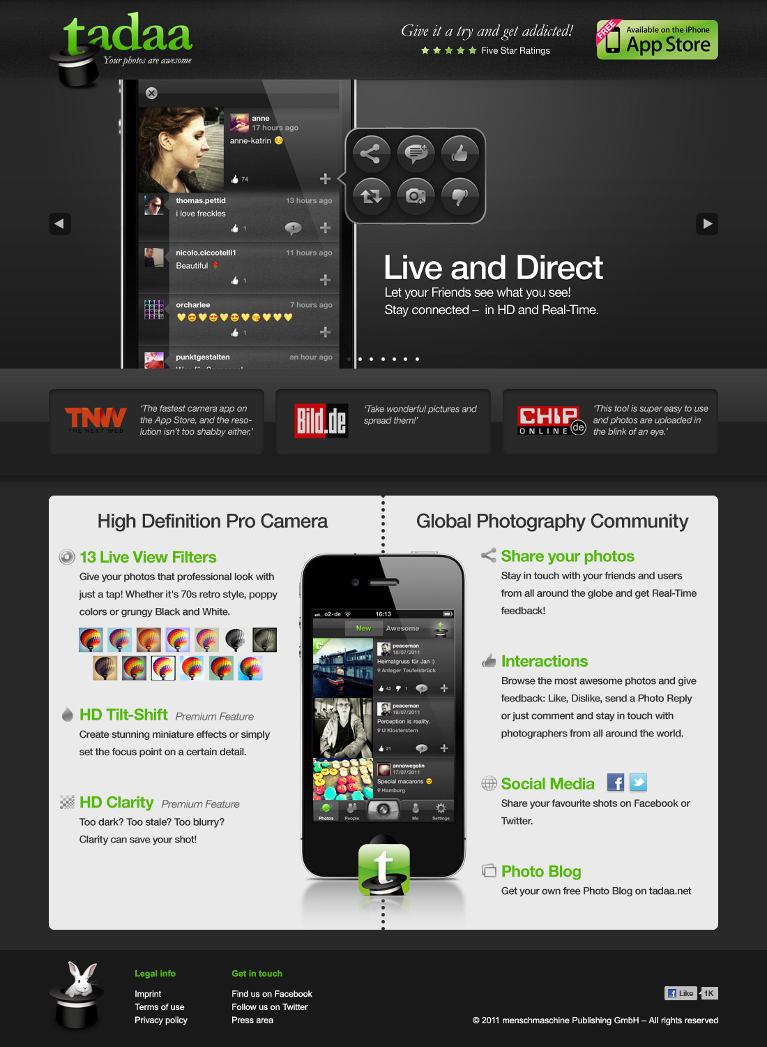
Website for tadaa
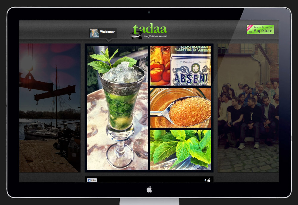
Fresh out of the freelance design oven comes a new website for tadaa. Earlier this year I helped this German startup with giving their brand a new look and user interface.
Tuesday, August 9, 2011
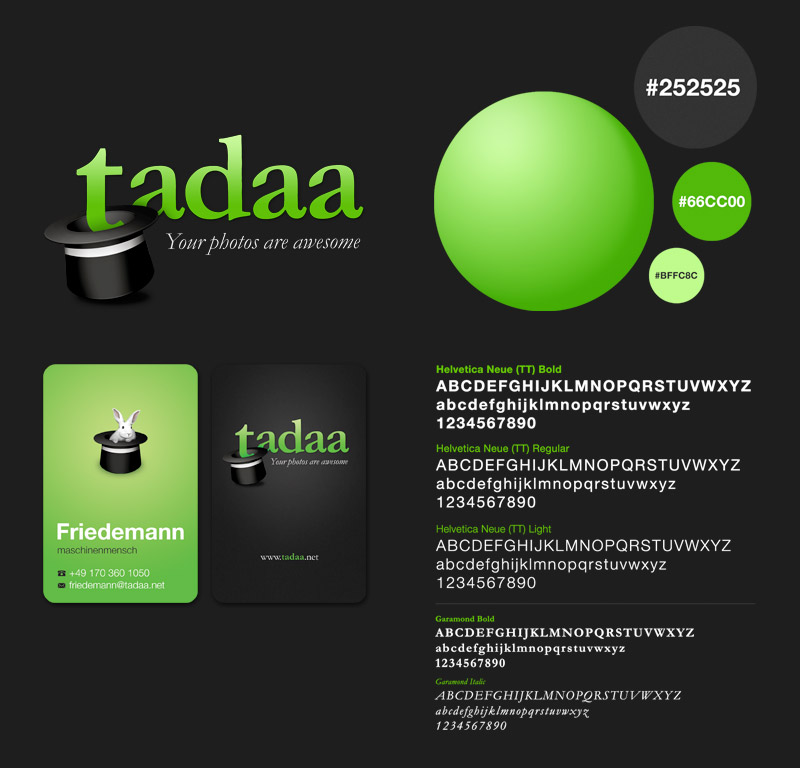
tadaa – branding, design and user experience
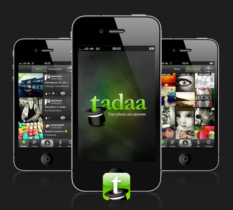
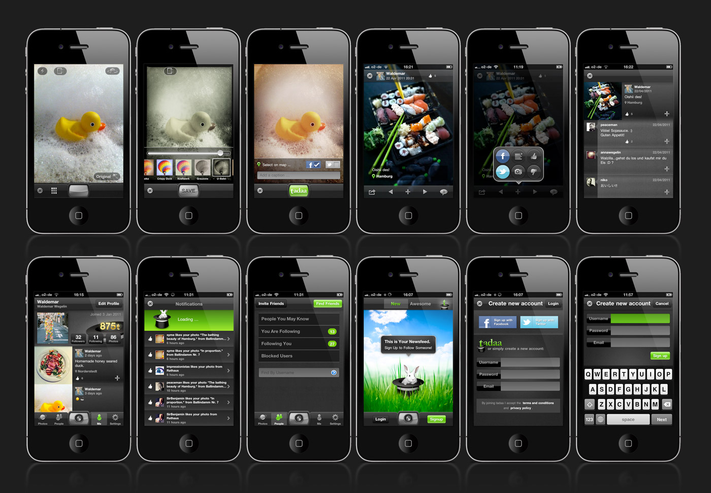
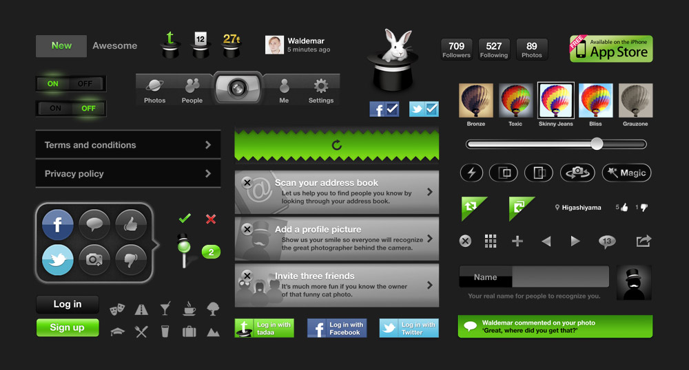
For the past few months I worked together with a start-up in Hamburg to help them create tadaa – an iPhone application all about photos. It has a lightning fast camera, a bunch of cool filters and a deep community system to help people share photos and interact with each other. On top of that every user gets their own tadaa photoblog with all their published pictures automatically added to it, here's mine for example.
My part in this project was the whole visual side: creating the tadaa brand look and feel, designing the whole user experience and interface and creating everything from the smallest of buttons to the website. tadaa is the first mobile application I fully designed. The process wasn't always easy but I learned a great deal during this project. Here are five things I've learned along the way:
- 1. Designing an iPhone app is a huge amount of work and requires a lot of attention to detail. Achieving consistency across the whole application and creating a balanced look while remaining user friendly is very very time consuming.
- 2. It's not about great looking static screens – transitions, animations and interaction states are as important to the overall look and they require care.
- 3. User feedback is essential to improving the experience, there's no perfect design and the app is hardly ever finished, there's always something to improve. If I'd start this over again, I would try out more radical design approaches and get more feedback on it.
- 4. The retina display is a tricky thing – the resolution is quite high and tempted me often into sleepless nights of designing details no one else would notice. It's important to keep the older low-res displays in mind at all times. Also, downsizing from retina to low-res was not as easy as expected and vectors / smart objects were the way to go here.
- 5. Probably my biggest insight: Getting a user experience designer / art director on board as early as possible is crucial. I joined the project after the developers already created a simple 1.0 version of tadaa where most functions already had a distinct user flow. At times this project was too much about redesigning a questionable user experience rather then re-imaginging a new one from scratch that would serve the user more. Starting over is a luxury that requires a lot of time and guts.
It was great to be involved in the tadaa design project. I think this app has great potential to compete with Instagram and Co. especially in the area of user community and photo interaction. I love the fact that people can have conversations around photos and reply with a photo to an existing one. There's lots of room to grow and I hope to be of help while improving this product. The tadaa app is free and can be downloaded from the iTunes app store. Give it a try and let me know what you think of it. My tadaa username is 'Waldemar'.

Tuesday, May 10, 2011
A new Redesign
It's spring, time for newness. It's been a while since I changed something here, the blog design was getting a bit dusty. Especially the title 'Wal's Hyper Island adventure' was out of date, since I graduated last year – time flies. Sure, everything is still an adventure, but now it's pHI, post Hyper Island. Hope you like the new design, it's fresh and clean. Here's a last glance at the old layout.

Monday, May 2, 2011
A family crest
 While the Royals were getting married I had my own share of family history. My dad turned 50 last week and because of us being such a large family I decided to create a family crest as a gift for him to bear.
It holds a few symbols but mainly speaks of solidarity, growth and the joy of life. It was great fun to work on.


Tuesday, February 16, 2010
Rebranding the Swedish Armed Forces
Below are the results from our last module Client, Design, Strategy & Branding.

BACKGROUND AND STRATEGY
Sweden has not been in war since 1813. The focus for the army is now peacekeeping abroad. Starting 2010 the Swedish military service is no longer mandatory. So the Swedish Armed Forces want to attract talent – brain rather than muscles – to fullfill their missions abroad. Our challenge was to rebrand the Swedish Armed Forces from a traditional defensive collective into a modern employeer.
THE OLD BRANDING

THE NEW LOGO
We got rid of the sword that symbolizes attack. We kept the shape of the shield, it’s made by two hands that clasp together, a metaphor for conflict resolution. The shield could also be seen as the ladder for personal development. On top we have the three crowns combined into one.


CAMOUFLAGE OF DIVERSITY
Camouflage is used for disguising yourself in the nature. We turned this around and created a new camouflage that is all about showing yourself. It reflects the diversity within the organization.
 THE SUB BRANDS
 ONLINE, CORPORATE & PRINT
 THE GROUP PROCESS
Robbin Ingvarsson, Fredrik Holmberg, Kristina Herngren, Anke Buchta, Simon Schlüter & Waldemar Wegelin
Thursday, January 28, 2010
Client, design, strategy & branding
 Module number 6 has been running for three weeks now and it's called 'Client, design, strategy & branding' – big words in one sentence, but it fits. We're a new team of six people working on one big client together with DDB Stockholm – The Swedish Armed Forces. The challenge is to reposition them as a forward thinking brand that is a viable employer beyond duty the on ones country. Due to the limited amount of time we compressed the research stage into a week and developed a strategy that points our way. We assembled various visual identity directions and had a first presentation to the client with this selection of routes. Now we've settled on one of them and we're creating an identity across different medias that reflects our chosen strategy. The final presentation is this thursday – I am looking forward to share the results.
Sunday, December 6, 2009
HyperDesk Part Two
After a long week filled by work with brands, brands and more brands I decided to take a couple of hours to clear my head with a drawing session and continued on my desk design that I started two months ago.

Sunday, November 1, 2009
Workshop with IDEO

One of the highlights of the course so far was a three day hands on workshop with IDEO. We had Fredrik Aidehag & Juho Parviainen from the Munich and London office of IDEO over at Hyper Island to give us a lecture and conduct a workshop on human centered design - just the way IDEO work themselves.
We worked in new groups for this assignment and each group identified a local business in Stockholm and approached them with this project. My group consisting of Linn, Ahmed, Mary, Joacim & Paula worked with a high-end hair salon in central Stockholm. The process that followed was divided into four main areas: Insight, Synthesis, Idea development and Prototyping.
Insight was about observing and understanding the scenario. We spend a day at the hair salon talking to employees, interviewed customers, documented the user experience and looked into all touch points of the business. We also talked to 'extremes' - people who would never use this kind of service and people who have very high demands on such a service. All this was documented in word, picture and video.
After the insight phase we started the synthesis phase: We gathered and structured different user stories, using the data from interviews. This phase was about framing opportunities from the researched material. We clustered observations and connected them with each other in order to extract behavioral insights. Having identified areas of opportunity we formulated several 'How might we...' questions - question that we would use in the next step, the brainstorming to develop ideas around them. Examples: How might we get people to be braver about new hairstyles? How might we lessen the feeling of risk of a bad haircut? How might we help people communicate what they want in a clearer way?
Brainstorming: to be honest, I've been in a few brainstorming session but never in a very effective one - I was never a fan of this type of idea development process. But IDEO showed us ways to facilitate effective sessions to harness the creativity of a larger group, and it worked a treat. Here are the 7 rules of brainstorming as used by IDEO:
rule #1 defer judgement
there are no bad ideas at this point because there's plenty of time to judge after
rule #2 encourage wild ideas
it's the wild ideas that often provide the breakthroughs and we can always bring ideas down to earth later, we new paths for non obvious ideas
rule #3 build on the ideas of others
think 'and' rather than 'but'
rule #4 stay focused on topic
you get better output if everyone is disciplined
rule #5 one conversation at a time
that way all ideas can be heard and built upon
rule #6 be visual
sometimes a picture really can speak a thousand words
rule #7 go for quantity, not quality
set an outrageous goal and surpass it!
Besides those rules, which are both obvious and crucial, there are other key points to turn the brainstorming session into an effective one. The group size should be quite big, 7-10 people is a good number, to keep the tempo of the session high. There should be a time limit, the session should be scheduled for a short time, but this time should be used effectively. But most of all, the work and research done beforehand helps the greatest deal: having the right focus or 'How might we...' questions to steer the group seemed to be the most helpful thing.
Using all those tools we generated an enormous amount of ideas in a short time around our chosen opportunity areas and after evaluating them in our team we settled for one specific direction: The hair salon we were working with has a rather creative approach, they want their customers to take more risks with their hair and be more adventurous. For this we focused on a voice controlled digital mirror that helped the customer and the person cutting the hair to explore more and daring possibilities.
Entering the fourth, last and most fun phase of human centered design: Prototyping or build to think. The solution we came up with had to be prototyped within 2 hours so we could share it with the course for feedback and further improvement. We had to take decisions on how things work down to the details, and act out the scenarios that could occur. The point here was to make the idea as real as possible as fast as possible. We had a great time building a corner of the hair salon and faking a digital & voice controlled display, emulating the experience.
Embarking on this new way of working was exciting and taught me the effective way of human centered design which opened up many creative opportunities within this project. I would have loved to work another week with the brilliant guys from IDEO. Going through the whole process with a specific client helped understanding this way to work and I cannot wait for the next project where I can put those methods to use. IDEO seems like an awesome place to work.
My three biggest learnings from this workshop:
- How to use behavioral research to gain insights and frame opportunity areas
- How to prepare and facilitate an effective brainstorming session in a big group
- How to bring an idea to life quick and dirty in order to see and improve its potential


Sunday, September 13, 2009
Update from HI
Life's great at Hyper Island. We finished off the second module with a client pitch / presentation which we prepared within 5 days. There was a total of three different clients but we were divided into groups so everyone was focusing on one. Our team was working on ICA Banken, a sub brand of a supermarket, similar to Tesco Finance. The brief was about imagining the future banking experience in 2015 and find ways for ICA Banken to become the most innovative bank on the market. We delivered a pretty cool concept and presented it well, it seems like it got the job done and inspired the client. If there's going to be time we'll put the idea it in a case movie / video format and I'll share it here.
Simultaneously we're working on a competition brief for DDB's Digital Days 2009 in Paris. The brand to work on is Lipton Ice Tea. We've spent all Sunday at school working on ideas for this brief because Hyper Island doesn't schedule any contests in the curriculum. After the concept session decided to finish the day off practising my drawing skills. I've got an idea for my desk here at Hyper, it's all work in progress but here's part one:
Simultaneously we're working on a competition brief for DDB's Digital Days 2009 in Paris. The brand to work on is Lipton Ice Tea. We've spent all Sunday at school working on ideas for this brief because Hyper Island doesn't schedule any contests in the curriculum. After the concept session decided to finish the day off practising my drawing skills. I've got an idea for my desk here at Hyper, it's all work in progress but here's part one:
Wednesday, August 12, 2009
My current wallpaper
 Got the sign from Matt Jones and placed it onto the colours I like at the moment.
It reminds me why I'm doing what I'm doing.
Monday, April 6, 2009
Cut & Paste
 On Saturday I made my way to Elephant & Castle to attend this years Cut & Paste. It's a digital design tournament with three categories, 2d, 3d and motion design. There are several rounds and the competitors have a slot of 20 minutes to design something that fits the given theme. The briefs they get were quite open like a record sleeve that's 'tongue in cheek', or a billboard about 'tough love'. It's interesting that the design process, which normally is quite intimate and happens behind closed doors, is shown so transparent to everyone.
It's good fun to have some beers and watch the designers on the stage sweating away trying to rock the show in this ridiculously short time frame with a genius idea. The crowd is cheering for their favourite competitor while the DJ plays a matching tune – it's designers performing on stage like rock stars, a great concept.


Tuesday, November 11, 2008

Wednesday, January 9, 2008
'08 Mugs
 This week we’ve been saying hello to some of london’s creatives by giving them their very own personalised Creative in London mug along with some chai tea. Hand crafting them was an absolute nightmare at first but soon became a rather soothing experience, providing flashbacks of our more innocent days at primary school. Well today we delivered them all and now can’t help but gaze at our inbox for replies. Fingers crossed.
Oh and big thanks to all at the London Graphic Centre for your help.

Tuesday, January 8, 2008
Where's Wally?
 Stumbled upon this fantastic painting full of cultural and historical icons on design fckr. Can you name all of them? I spent way too much time with it, good fun! But where is Michael Jackson? And who is that little girl? Questions…
Thursday, December 13, 2007
Yaolee
 This is yaolee, an idea I designed back in university. It's a wellness drink based on chinese herbs extracts to refresh mind and body – it comes in a small bamboo like packaging with a bright red brand mark on the front. I am a big fan of brand & packaging design and this is probably my most favourite piece I made.
Thursday, December 6, 2007
Designer Slash Model
 'Sometimes I wonder. Is my work beautiful because I am beautiful?
Or am I beautiful because my work is beautiful?
It's probably a little bit of both.'
If you ever wondered how work & life is like in the creative industry, see the truth here at designerslashmodel.com. I discovered this gem a few months ago but never came around to post it. It is a brilliant self promotion /slash/ reel for Digital Kitchen, a US based motion design studio. Enjoy the video and remember – looking creative isn't enough, looking hot, that's the tiebreaker.
'It's as simple as this. Perfect people create perfect design.'
Tuesday, November 20, 2007
Put your hands in the air
 Last week while looking around in Selfriges on Oxford street, the UK's second largest shop I came across something funky. The limited edition of Absolut Vodka packaging – Absolut Disco. A shell for the iconic vodka bottle which can be attached to the ceiling to function as a disco bottle, simple idea but oh so cool. A gift packaging which not only looks good but is very useful and full on brand, I bet the vodka drinkers will love it! I want to buy one just for the packaging, but then again I'm very seduced by this kind of design stuff.
 If this isn't enough they have a digital experience to back this up, hit www.absolut.com/disco and if you have a webcam record your disco moves and funk them up with certain visual effects.
Responsible for the concept was Swedish agency Family Business, well done. although I must admit the the web experience isn't really flawless, it took eight hours until the email arrived with my blog code since they seem to check all the videos pre-release – also the webdesign, especially the html email isn't reaching the standard Absolut Vodka usually sets.
Monday, November 5, 2007
Redesign
 This blog design seems to get dusty. Just ordered the whole set of Make My Logo Bigger Cream in order to funk it up, bring the colours out more and that. Aaahrw, I cannot wait to rub that Emotionator onto my design and harvest those thousands of new arriving visitors, all thrilled by the visuals. See yourself at www.makemylogobiggercream.com
For preparation, I started already by labeling ALL the previous posts, so readers can navigate quicker through the content, even I have to compromise my dear un-usability for that.
Friday, February 16, 2007
Val's old old homepage
 Just been googling my name (I wouldn't believe anyone saying he or she never done that!) and found some old stuff on the internet, like my very first homepage. The website is still online mostly for sentimental reasons and as a reminder for me to make a new one. Well, I wanted to make a new one for about 3 years now, dozens of layouts later still nothing happened - it's so much easier having a blog isn't it?
Anyway magicstyle.net is now over 6 years old, Kristin says it looks like I was a geek before, maybe she's right? (ok I was into fantasy back in high school when I did this website).
Sorry for those who can't read german, but you won't miss much. Also found that I still have an account on deviantArt. I am really motivated to do more design again, all this black marker white layout pad thing is pretty good for ad ideas, but where is the beauty in that? Yes I'm a design addict and I'm thinking about getting hooked again...
I feel like posting one of these 'five things you don't know about me' entries - probably feeling the urge since we never got tagged.
Subscribe to:
Posts (Atom)