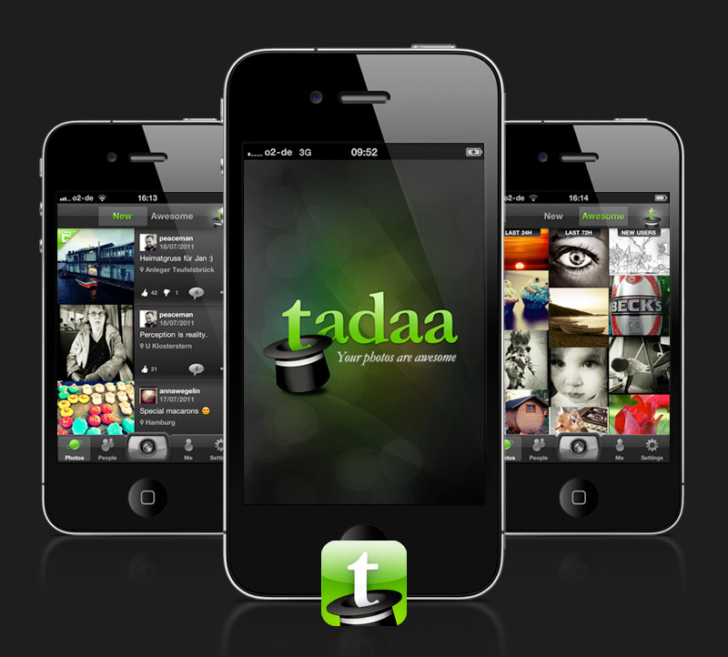
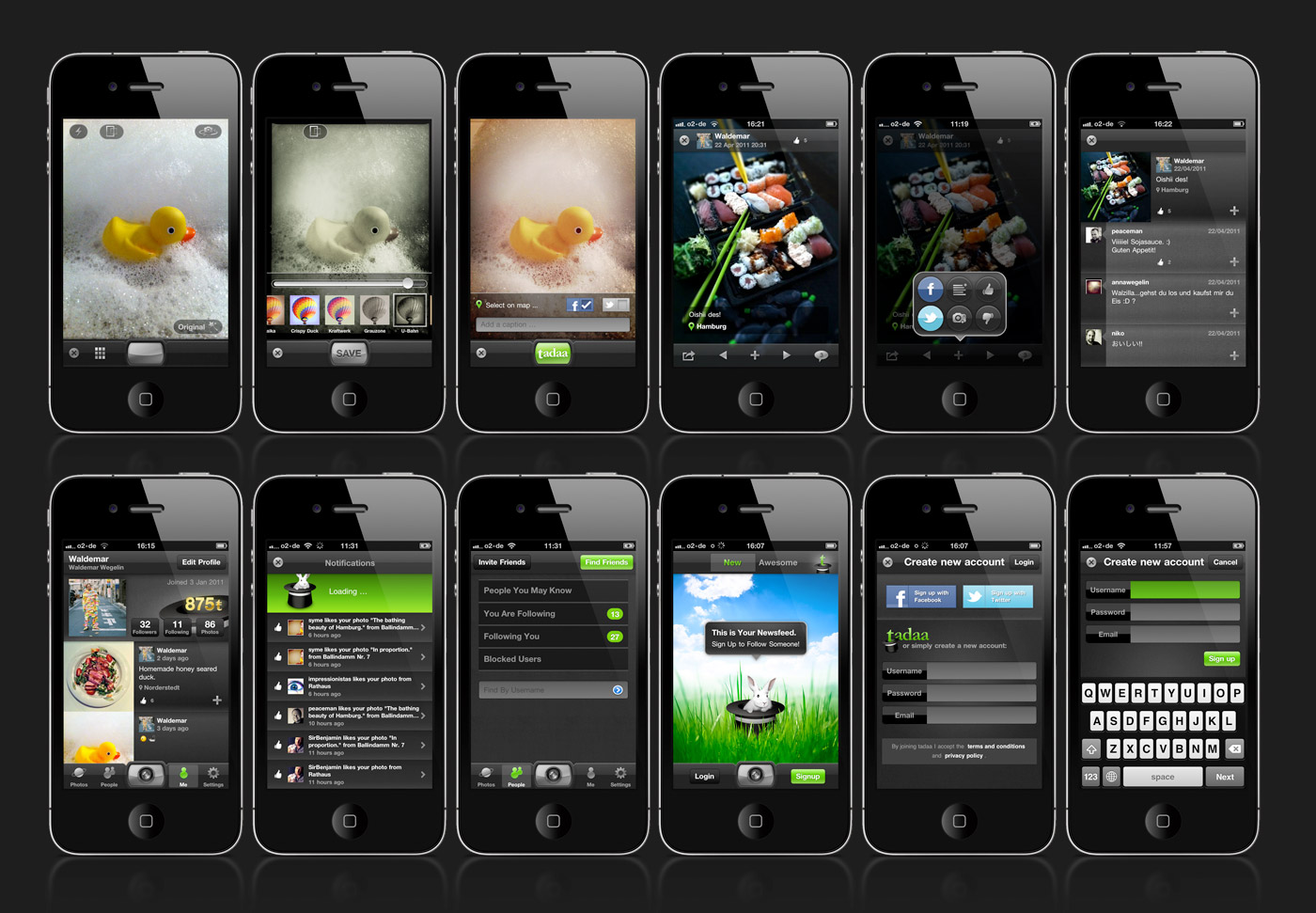
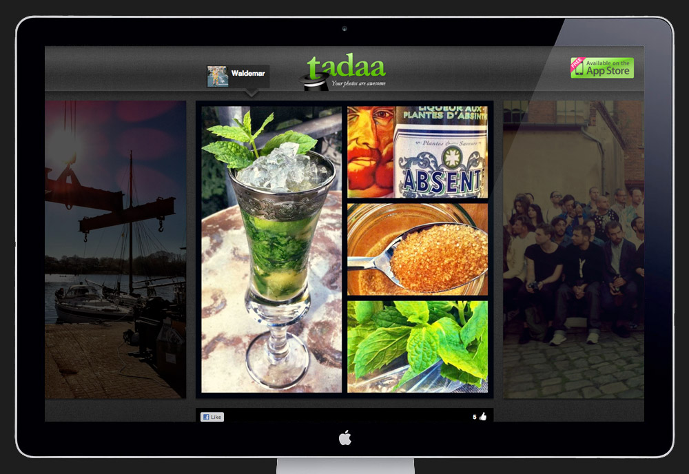
For the past few months I worked together with a start-up in Hamburg to help them create tadaa – an iPhone application all about photos. It has a lightning fast camera, a bunch of cool filters and a deep community system to help people share photos and interact with each other. On top of that every user gets their own tadaa photoblog with all their published pictures automatically added to it, here's mine for example.
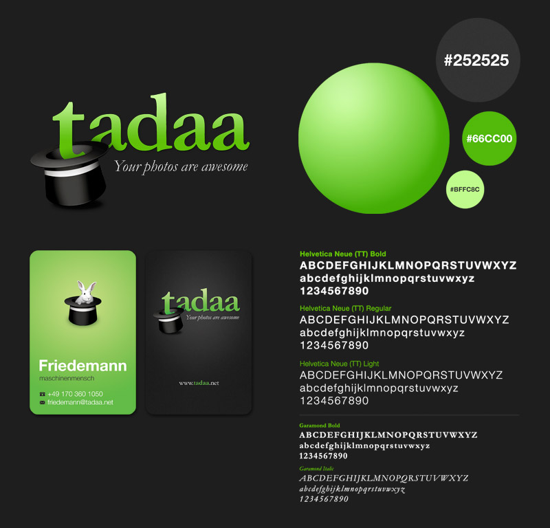
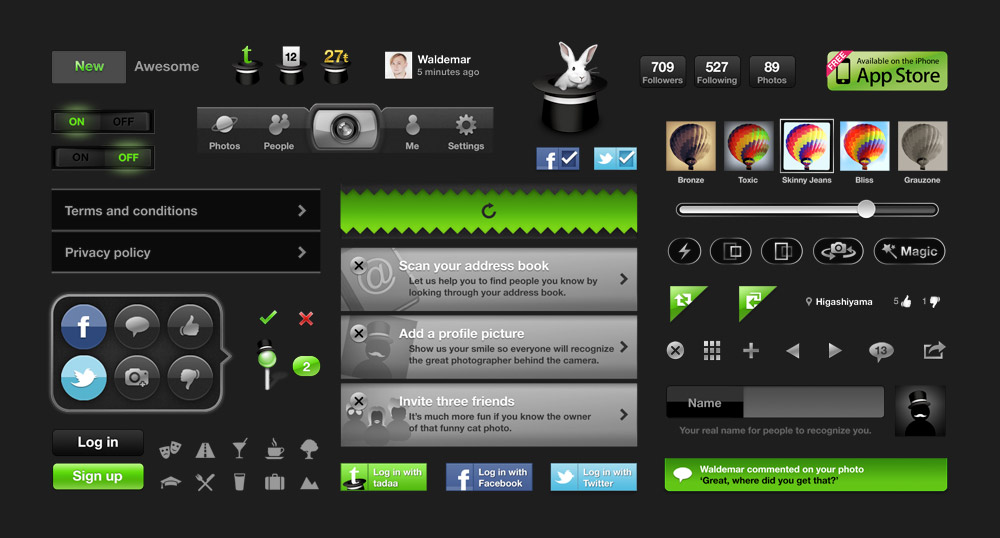
My part in this project was the whole visual side: creating the tadaa brand look and feel, designing the whole user experience and interface and creating everything from the smallest of buttons to the website. tadaa is the first mobile application I fully designed. The process wasn't always easy but I learned a great deal during this project. Here are five things I've learned along the way:
- 1. Designing an iPhone app is a huge amount of work and requires a lot of attention to detail. Achieving consistency across the whole application and creating a balanced look while remaining user friendly is very very time consuming.
- 2. It's not about great looking static screens – transitions, animations and interaction states are as important to the overall look and they require care.
- 3. User feedback is essential to improving the experience, there's no perfect design and the app is hardly ever finished, there's always something to improve. If I'd start this over again, I would try out more radical design approaches and get more feedback on it.
- 4. The retina display is a tricky thing – the resolution is quite high and tempted me often into sleepless nights of designing details no one else would notice. It's important to keep the older low-res displays in mind at all times. Also, downsizing from retina to low-res was not as easy as expected and vectors / smart objects were the way to go here.
- 5. Probably my biggest insight: Getting a user experience designer / art director on board as early as possible is crucial. I joined the project after the developers already created a simple 1.0 version of tadaa where most functions already had a distinct user flow. At times this project was too much about redesigning a questionable user experience rather then re-imaginging a new one from scratch that would serve the user more. Starting over is a luxury that requires a lot of time and guts.
It was great to be involved in the tadaa design project. I think this app has great potential to compete with Instagram and Co. especially in the area of user community and photo interaction. I love the fact that people can have conversations around photos and reply with a photo to an existing one. There's lots of room to grow and I hope to be of help while improving this product. The tadaa app is free and can be downloaded from the iTunes app store. Give it a try and let me know what you think of it. My tadaa username is 'Waldemar'.


6 comments:
you did an amazing job! I love tadaa.
Great stuff Wal, love the details
Very good, and also a good post about the process. Are you and Robbin going into an agency again soon?
Thanks. Hopefully there will be good news very soon regarding our next challenge with Robbin.
Hope so buddy! Rooting for you. :)
Magnificent!
Post a Comment